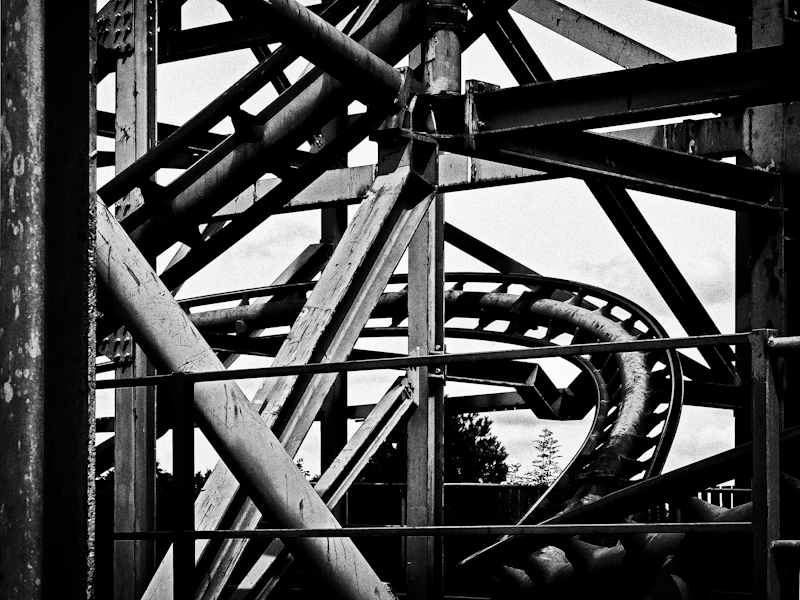
Engineers have turned their attention to all manner of things, developing machines to serve us in many ways – for example, to feed us, transport us, clean us, kill us, and in the photograph above, to frighten the living $&%! out of us.
Camelot is Chorley’s own theme park, and about ten minutes from my house, but until last week I hadn’t visited since about 1988. The intervening years have seen some sizable additions, but the place is looking a bit tired. Faded awnings, faded and peeling paint, closed food outlets, weeds growing and dead leaves in rides – I’m sure it was all perfectly safe, but some of it was looking a little frayed around the edges. But despite this, people were there having fun, the sound of laughter and the screams of excited passengers on the massive ‘Knightmare’ ride could be heard as it swept across the park, tangling itself in a knot of track before emerging out again at high speed.
As I stood and watched it writhe around its mechanical maze, I became intrigued by the complex web of steelwork keeping the thing standing. Such are the stresses and strains, and the safety critical nature of the thing, it all appeared somewhat random, or even over engineered, but it will all have been carefully calculated by structural engineers with sizeable brains. I could have stayed there and studied it for ages, but my family couldn’t, so I managed four compositons and moved on to something more frivolous.
When taking the photos, I had in mind black and white conversions as the textures and shapes were interesting, it was just a pity the light was so flat. Compared to the others, the photograph above is possibly my least favourite, as the rails in the foreground are too dominant, but I’ve found that the more I look into it, the more I see. I’ve deliberately cropped it so that there are strong verticals at each side of the image to keep the eye in the frame, and I like the seemingly random jumble of elements juxtaposed around the frame – curves, diaganols, uprights, horizontals, they’re all in there.
Now take a look at a high contrast, high saturation version of the original. The points of interest change, and, to my eyes at least, the foreground railings seem to get lost and become less dominant, while the sky suddenly becomes a part of the picture, possibly because of the colour harmony between the blues and yellows.

