“It is impossible for a photographic print to duplicate the range of brightnesses (luminances) of most subjects, and thus photographs are to some degree interpretations of the original subject values. Much of the creativity of photography lies in the infinite range of choices open to the photographer between attempting a nearly literal representation of the subject and freely interpreting it in highly subjective ‘departures from reality’ My work for example is frequently regarded is ‘realistic’, while in fact the value relationships within most of my photographs are far from a literal transcription of actuality. I employ numerous photographic controls to create an image that represents ‘the equivalent of what I saw and felt’ (to paraphrase a statement I heard on a number of occasions from Alfred Stieglitz – the great photographer of the early twentieth century). If I succeed, the viewer accepts the image as its own fact, and responds emotionally and aesthetically to it. It is safe to assume that no two individuals see the world about them in the same way.”
Ansel Adams, The Negative
Ansel Adam’s trilogy of books The Camera, The Negative and The Print are now decades old but while the darkroom techniques are now largely irrelevant to anyone using digital, the principles behind the creation of creative black and white images remain true.
For Ansel, the negative was just the starting point. In his book ‘The Print’ he describes how he printed his famous ‘Clearing Winter Storm’;
“During the main printing exposure of 10 second,, I hold back the shadowed cliff area near the right edge for 2 seconds, and the two trees in the right hand corner for 2 seconds…..After the basic exposure, I burn the bottom edge for 1 second and the lower left corner for 3 seconds. I then burn the left edge of the print for 2 seconds and the right edge for 2 seconds, in each case tilting the card to favour the sky.
Burning is required from the base of the sun lit forest areas, near the waterfall, to the top of the image, with three up and down passages of 3 seconds each. I then burn the sky along the top for 10 seconds, continuing with the 2 and 4 seconds at the upper left corner. Then using a hole 1 inch wide, I burn the central area (between the two cliffs and the clouds above) for 10 seconds, and then bring the hole closer and burn the smaller area of cloud for an additional 10 seconds.”

Phew!!! a testament not only to his vision (and being in the right place at the right time), but also his ability to translate that vision, using his knowledge of exposure, film, paper and developer properties and of course his printing expertise.
But the parallels are starting to become clear with the digital darkroom. Where before there was a negative, there is now a raw (or possibly a jpeg) file, while the variables of development and printing are practically eliminated.
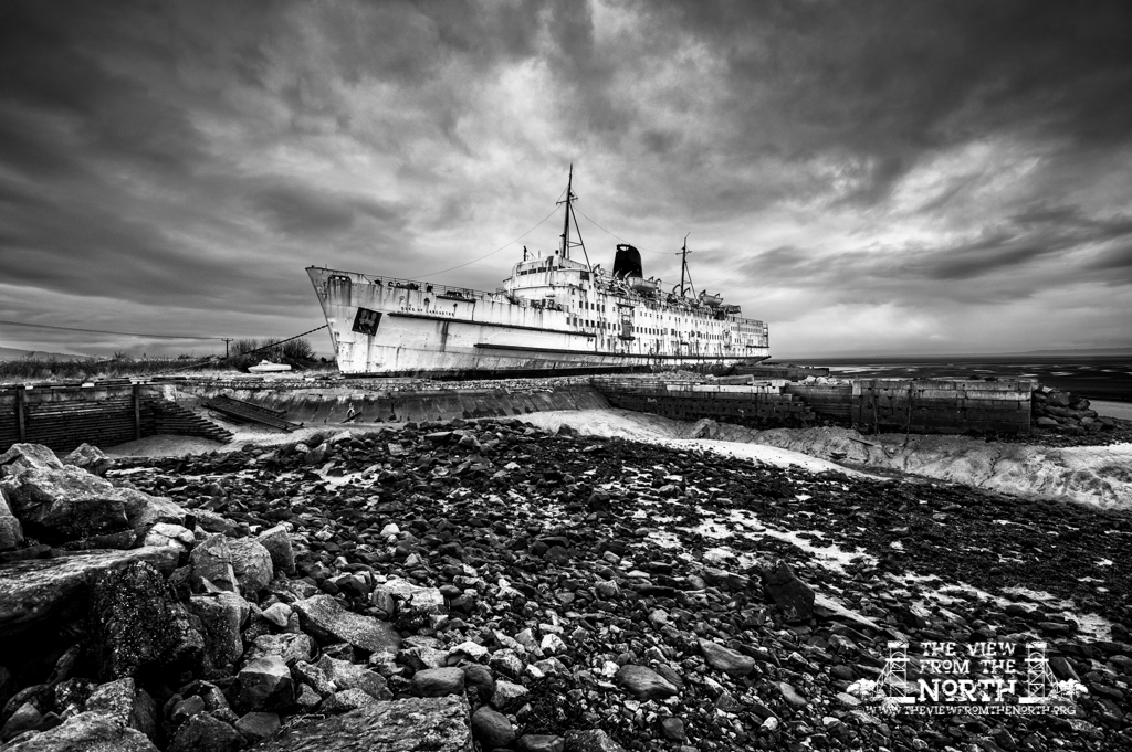
The images of The Duke Of Lancaster that I’m using are ones I’ve used several times before in this blog, and I’ve even gone into my thought processes, but here I want to explore them a bit deeper, more the why than the how.
I started with some research – the internet is a godsend for this kind of thing! I looked at the location on Google Earth to get an idea of the topography, as well as look at loads of photos on flickr and Geograph http://www.geograph.org.uk/gridref/SJ1779. Photos on Geograph are rubbish from a creative perspective, but do give a good idea of the surroundings, whereas the flickr ones are more variable. While good from an inspiration perspective, none of them really moved me, although some of the night photographs are superb! However, on this occasion, night photography wasn’t what I was doing. While it would have been nice to have chosen the optimum time of day, light and weather conditions, I didn’t have that luxury as I don’t exactly live on the doorstep, neither do I have unlimited opportunities to go out and photograph.
So what did I have in mind? I wanted to interpret the scene as I felt it. How do you ‘feel’ a visual scene that you have no emotional attachment to? To me a scene is not just the sum of the elements you see before you, that’s just composition. So what did I see and feel? I saw a sad scene before me, a proud old liner slowly rotting away in a forgotten old dock. The paint was rusting, the flags weren’t flying and the happy travellers had been replaced with the occasional urban explorer. It’s future is uncertain, but whatever happens the old ship isn’t likely to be sailing very far, or to a happy ending.I felt quite sad that this graceful old liner was marooned here so I wanted to portray something dark and dramatic, that had a sense of place. This brings me to the coastal landscape – I’ve always found estuaries a bit weird. There’s something about places where the land fades into the sea that is slightly surreal. Maybe it’s because they’re the only landscape that is constantly changing, or the lack of people and buildings, I don’t know.
Creative choices started at the location – lens choice (16-35 to get foreground, 28-70 to get the wider scene) composition (placement of the ship in the frame, how much sky to include, how much foreground) and exposure (underexposed to capture some detail in the sky). I then took 30 or so different images of slightly different compositions to give myself plenty of choice later on.
When I got back, I uploaded them to Lightroom and viewed them all sequentially in a slide show, ranking them 1-5 as I went on, and then just viewed the ones with 4 and 5 stars. I then switched the computer off and left them for a few days and came back to take another look. It’s surprising how you see things differently once you come back later. I then made my final selections, based on what ‘looked right’.
As someone far wiser than I once said, every image contains a hundred others. I now had my starting point, but I now wanted to transform it into something which communicated what I had in my head. As the image was a raw file, it all looked a bit dreary and flat, so I had to start the processing in Lightroom. I had in my head a high contrast black and white with a dramatic sky, so I needed to recover some detail in the sky first of all. Thankfully, I’d underexposed so there were no burnt out highlights.
This left a muddy looking image, but you can only do global adjustments in Lightroom, so I had to move to Photoshop to start the buggering about with layers and making local adjustments to curves, sharpening, etc.
Once in Photoshop, I converted to black and white using Nik Silver Efex. There are loads of ways of converting in Photoshop, none of which I can be bothered with as I foind the Nik plug in both easier to use and provides a better result. In Photoshop proper, I made separate selections for the sky, foreground and ship, which are the three key compositional elements. The sky was adjusted using curves, as was the foreground. I also created a duplicate layer of the foreground and changed it’s layer type to multiply to give it the contrast I was looking for. I also adjusted the brightness of the ship slightly to make it stand out against the dark backgrounds, as well as giving it some extra sharpening.
Result: well if you read this blog regularly, you’ll have seen it before, but I’m most pleased with it, and recently got it put on a 30 x 20 canvas by Vista Digital in Longridge near Preston, who I can highly recommend, as inkjet printing of monochrome images is difficult and they did a superb job of it! My own print of it also came second in the Brownedge Arts Festival Photographic Competition, the prize money more than off setting the cost of the canvas!


So what are the lessons I learnt from this?
1) Think about how the scene in front of you moves you.
2) Think ahead when choosing your exposure.
3) Where possible, do some research in advance. Some photographers prefer not to view other images of the scene as they want the photograph to be theirs, not influenced by someone else. I can understand this point of view, but you’re missing out on potentially some great ideas for compositions. You don’t have to copy, the creative choices will always be your own!

Leave a comment