2021 Version 1.0
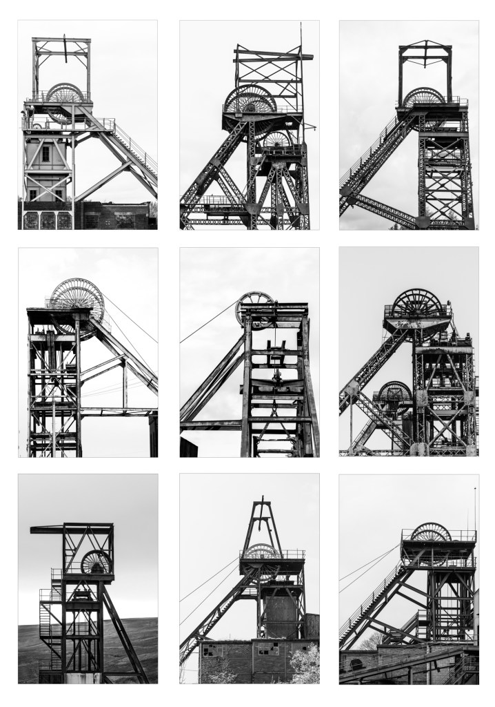
So with the photograph of one of the Snibston headstocks available for inclusion, I took the opportunity to refresh the typology and add in Grove Rake and Magpie Mine that I’d not included before.
Grove Rake I took back in 2016, long before this project was conceived and so isn’t optimal really, but until I can be bothered to go back there (and it’s a bit of a slog) this will have to suffice. Compared to some in this project, it’s quite easy to photograph as there is a roadway leading down a hill to the mine, and this is where I took this from.
Magpie Mine I took in 2020 but it is significantly smaller than the other structures and, along with the Grove Rake photograph, I couldn’t really make work when I added to the existing 6 photographs to make a 2×4 grid. So I delayed adding them until such time as I could make a 3×3 grid.

The 2020 Version
Aesthetically, a 3×3 grid seems to work better, and I’ve noticed that the vast majority of the Becher’s headstock typologies were on 3 rows, either being 3×3, 3×4 or 3×5. Any bigger than that and I imagine that they would become difficult to display – you’d need a very big wall or a very big page in a book. Sure you could print them smaller for hanging in an exhibition (from memory, I think they were somewhere between 15×10 – 20×16″ prints at Cardiff but I could be wrong as I didn’t measure them), but then you lose the detail and the ability to look at them more closely.
I’ve also had a re-shuffle of the pictures, and the keen eyed will notice a different version of the Florence Mine headstocks. I personally prefer this photograph but it didn’t work in the previous typology, however, in the reshuffle, I’ve put the photographs on the bottom row that have a darker background or base, to visually ground the image. OK, so Barnsley Main in the top left hand corner has a dark base as well, but I think I’ve got away with it in its current position.
Finally, I’ve opted to place Magpie Mine in the middle. It’s not the strongest image, but the space above the winding wheel matches that of the images either side (that’s more luck than judgment in fairness). I did think of putting the tandem headstocks from Snibston in this middle spot but it just didn’t look right. As I’ve said before, this project is all about the visual diversity and differences in what’s left, but its inclusion is a step too far just at the moment. Maybe in future iterations I’ll be able to integrate it in a way that works!

Leave a comment