As I wasn’t using the optimal lens for the job, cropping played an important part of post processing., and this is where having a reasonably high megapixel count comes in handy. Now I’ve never subscribed to the theory that you should get it right in camera and never crop – it’s a laudable idea, but sometimes a crop can improve a photo. In these instances, I’ve cropped to improve the composition of the final image, as I simply didn’t have the reach using the lens I had.
Deciding on where to crop so as to get a balanced composition is difficult, but the tools in Lightroom do make the task itself easy. Some of the images lent themselves to a square composition (link to previous blog post on square), while others remained in the same format but ended up smaller to remove any extraneous elements. What constitutes extraneous? Basically, anything that is not adding to the composition, or something that, if removed, would not detract from what is left.
As mentioned in the previous post, in an ideal world, I’d like to have been a lot closer, and not having to rely on a short telephoto to capture the image, but that simply wasn’t an option in the circumstances.
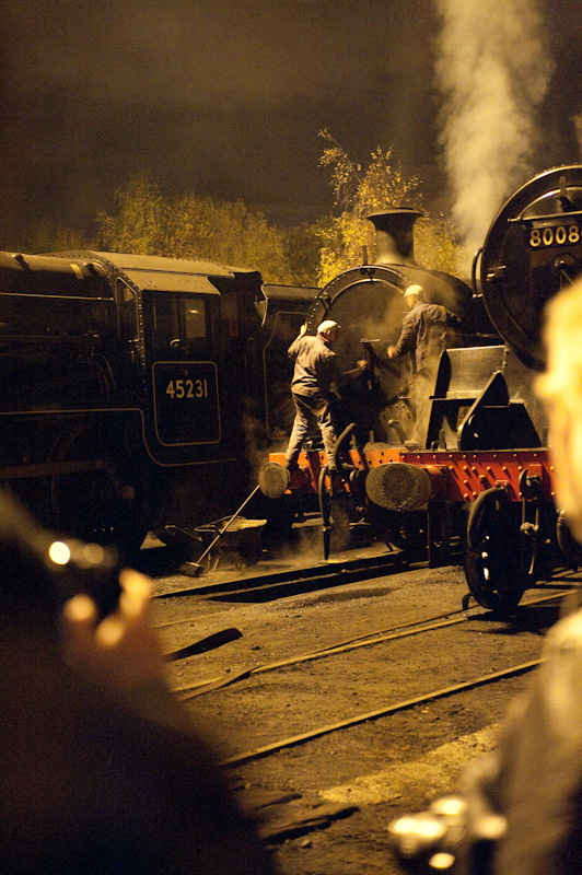
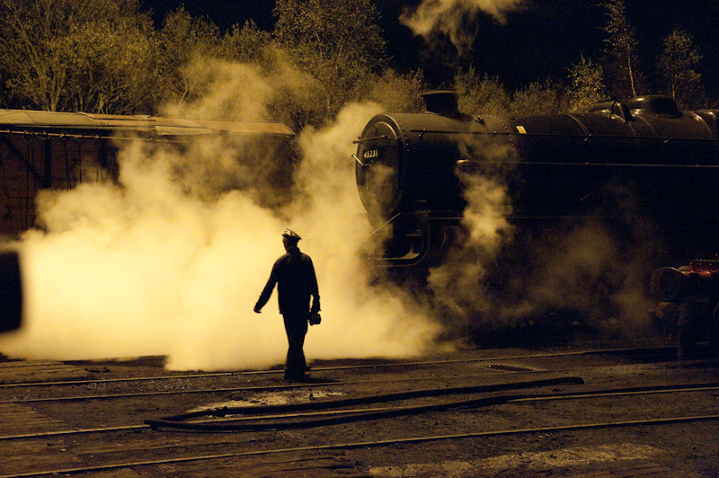
To show the extent of the crops (and the post processing generally), I’ve included the original unprocessed file as it was out of the camera.
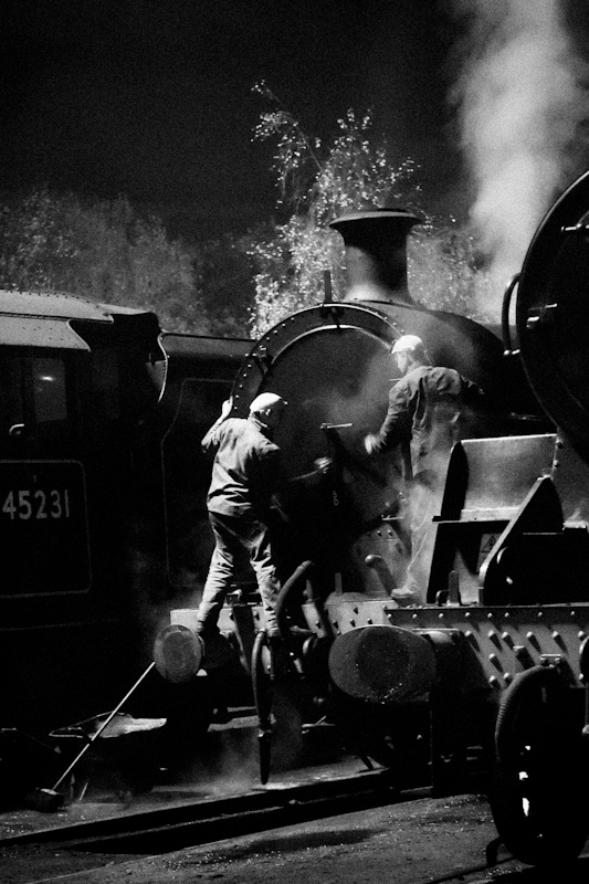
To get into this position, I ended up in amongst an impenetrable forest of tripod legs, camera bags and other photographers. A crop was essential to get rid of the foreground.
 I was unsure of if I should crop this, or even how, but a square format allowed me to emphasise the repetition in the composition. It would probably work as well with a less drastic crop.
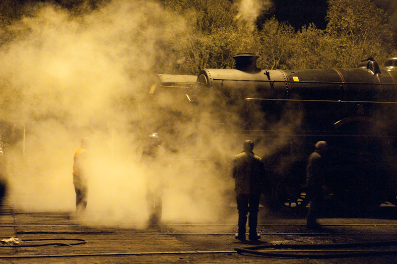
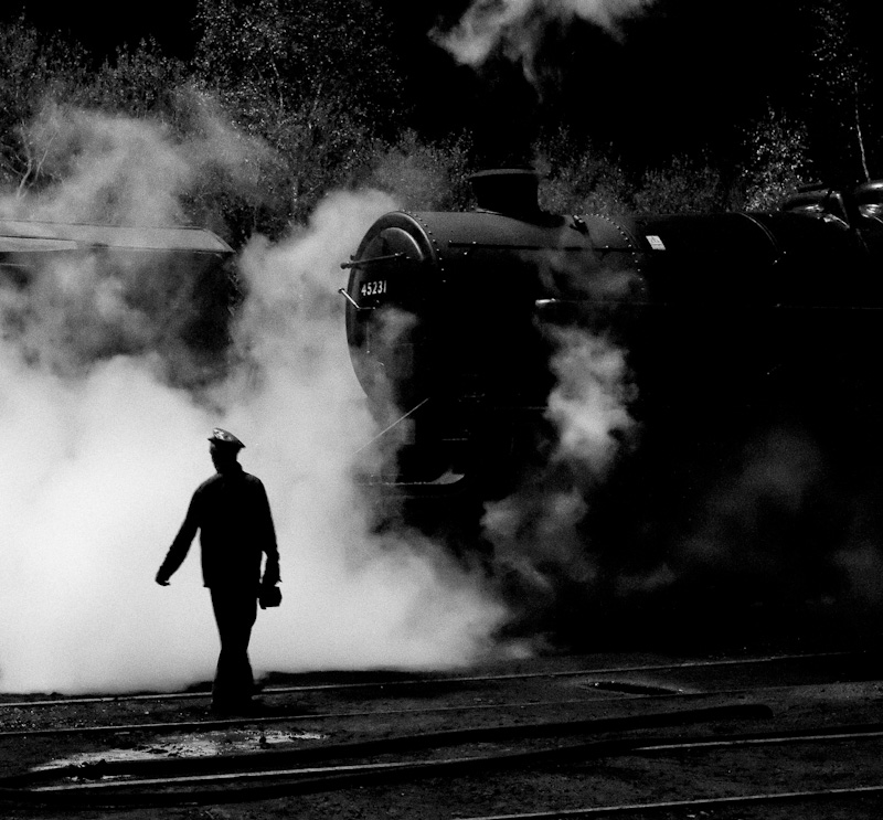
In this, there is nothing happening in the photo to the left of the driver, so off it went. The question then was how much of the rest of the image to remove while retaining balance. I’m still not sure I’ve got it right, and it may need some reworking before it looks and feels right.
Interesting to see the original shots for comparison. Thanks for including them. The first one has a very “heroic worker” feel.
LikeLike