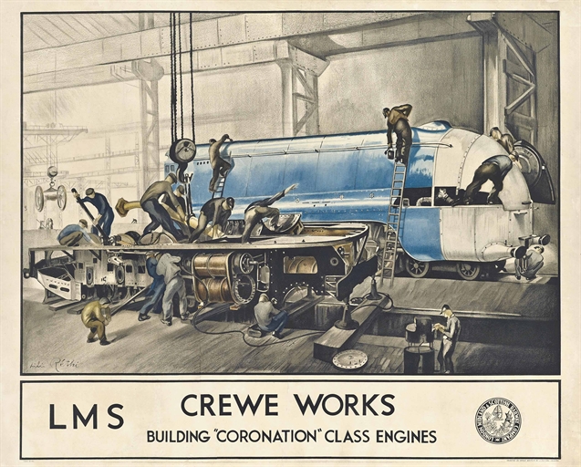
I’ve loved this particular one since I saw it in a book of railway posters I got about 15 years ago, and have even managed to get a fantastically bad colour photocopy from the National Railway Museum. I imagine colour photocopy technology has improved over the past 10 years so I might see about getting another one.
A Google search has revealed that Lili Rethi did a lot of industrial and architectural artwork and with a meticulous level of detail. There appears to be no monographs of her work unfortunately.
I love the romanticised interpretation of heavy industry, and the energy in the photograph – there’s a real sense of movement and industrious effort. But I also like the standard of draughtsmanship as well as the use of colour – clearly the paint was the last thing applied to a locomotive in real life, but the artistic leap of faith has allowed what looks like a Princess Coronation to really stand out against the background. It’s almost like the use of selective colour in photography, while the use of a form of aerial perspective allows the background to fade away and be less prominent.
Marvellous!


Leave a Reply