It struck me recently that I probably convert too many of my photos to rblack and white. I got to thinking why that was and I remembered back to when I was putting my RPS portfolio together, and I was advised not to mix colour and black and white. I noticed as well that many photographic books, especially monographs, are either one or the other, and rarely both.
However, given the subject matter I am often photographing for theviewfromthenorth.org I find myself veering between the two. In the earlier days, I kept much of my stuff in colour, and often took along a film camera to shoot black and white. As I got more confident, I found myself just shooting digital and converting a few to black and white in post processing. More recently, since I’ve been using Nik Silver Efex Pro, my black and white workflow has sped up enormously, and I can see what an image looks like easily before making the decision to convert. Ironically, most of the earlier stuff still works best in colour for some reason.The turning point seems to be Fletchers Paper Mill – I’m not sure whether I perhaps started to ‘see’ in black and white or whether the lighting and subject matter really suited it. Later, I was encouraged by a number of well respected photographers to stick with black and white as my subject matter really suited it. Since then, I find myself more often than not converting the entire set I load online to black and white. It’s almost become my style now, although maybe I’m becoming a slave to it?
This got me thinking as to what works and what doesn’t, and when colour should be used.
Black and white

In this the eye is drawn along the length of the picture by the whiter areas to a vanishing point.
Harold Davies in his new book ‘Creative Black and White Photography’ writes:
The image should itself present a compelling visual reason why it is monochrome. Here are some possibilities:
• The graphic content of the image is clearer without the distraction of color.
• A great contrast is being presented between darks and lights.
• Shadows play a big role in the image.
• The subject matter of the image is in some way old-fashioned or anachronistic.
I have to admit that this is a good a list as any I’ve seen. John Beardsworth in ‘Advanced Black and White Digital Photography’ is of the opinion that a well composed picture will work equally well in black and white or colour. I tend to disagree slightly – they may work in both, but not necessarily equally well.
Of course, if you’re shooting black and white film, then you’re stuck with monochromatic images, and have to be more careful about how and what you’re shooting.
In my fairly limited experience of black and white, I’ve found that I tend to convert to monochrome when I see;
- High contrast
- Muted colours
- Shadows – photo of frame in shadow at Ditherington.
- Hiding burnt out areas
- Some scenes that are already inherently black and white – wintry landscapes on cloudy days, whereas a sunset is obviously colour.

Shadows in Sardinia – so much of the scene was in shadow that it made sense to convert to black and white.

Ditherington Flax Mill, here, the shadows are far more delicate
However, there is more to black and white than a checklist of criteria!
Tonality
Tonality is more important in black and white than in colour as there are no hues involved, just different tones ranging through black to grey to white, thus the information in the image is delivered differently. Digital images (and film negatives if I remember correctly to my darkroom days) seem to come out inherently flat, so the magic happens in post processing.
Implication / Suggestion
One thing I personally use black and white for is when I want to imply something, such as setting the mood or tone for a collection of images. In my own photographs, I like to go for a stark, oppressive look with high contrast that is dark and moody, and is well suited (I think) for industrial decay.
What is this photo saying? It could say many things………
Similarly, my steam railway photos I convert as they’re a subject that people almost expect to see in black and white. I suppose that’s because steam engines are from another age, a time when all photographs were black and white. There’s also the fact that many of them are black to begin with. I remember reading a quote from I think O.Winston Link, probably my favourite railway photographer where someone had asked him why he rarely used colour. I’m paraphrasing but he replied “Engines are black, steam is white, what’s the point in shooting that in colour?” He was only half joking as he produced some exceptional colour images, but he has a point.

I consciously composed this to include the terraced houses and mill chimney in the background, to try and evoke the feel of a photograph from the 1960’s.
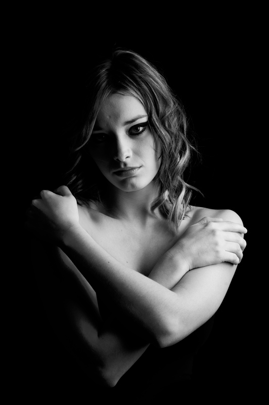
Here’s something you rarely see from me – people images. Yes, I do take them, but don’t tend to post them up on here as it’s not what this blog is about. But back to the point – how can black and white add impact to photographs of people? In these two instances, I like to think there is a strong air of mystery – in the first, the backlight is just revealing the profile of the subject, while the second the models (very small) black dress is barely visible, if at all, and as such is hinting at nudity.
Interesting textures / shapes
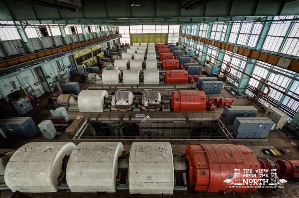
Sometimes in black and white you notice things that you simply didn’t in colour. Areas of a photo take on a new precedence. Colour can be a distraction. Take the image below of these cooling towers. It’s all about shape and texture, but the colour version is all about the blue sky.
Colour
Shooting colour should be easy, as we see in colour, and our cameras record in colour by default. Job done, yes? Well, yes and no. To make the best use of colour, then it’s not just a case of photographing what is there.
I’ll admit to not always consciously taking photos with black and white conversion in mind (the Duke Of Lancaster was a notable exception), although the beauty of shooting in raw is that you can in fact shoot in black and white, and indeed view the image in black and white on the camera’s screen, while actually saving it as a colour image. (If you’re a Nikon shooter you can use their proprietary NX2 software, and view the raw file in black and white if required. Personally, I’d rather saw my own leg off than use such a slow, clunky piece of software, and I much prefer Lightroom and Photoshop).
Eye is naturally drawn to the lighter, or highlight areas, which is why the edges of images are often burned in (or a vignette applied), so as to draw the attention to the lighter areas and supposedly keep the eye in the frame.
Could this work in monochrome? Probably not as well. The most striking thing about this image is not just the pipes but the predominance of blue, both in the pipes and in the sky.


Some very interesting thoughts. The comparison of the versions of the cooling towers shot really speaks for itself!
LikeLike
I’m so glad that I found your blog, I have a fondness for mechanical landscapes but they are getting much harder to find. I’ve had a great visit and hope to return.
LikeLike
Thanks Lynn, just been checking out your blog, I admire anyone who commits to, and follows through with, a picture a day project. Your website has some interesting images as well, keep up the good work! I’ll add your blog to my blogroll.
LikeLike