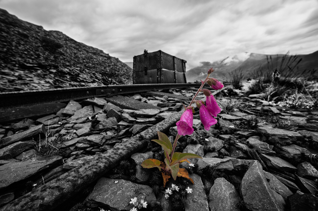
The finished image
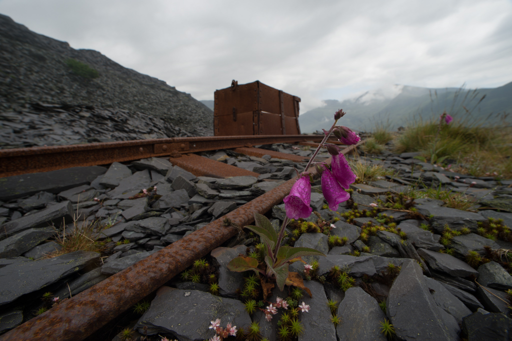
The starting point – pretty much straight out of camera with one or two tonal adjustments.
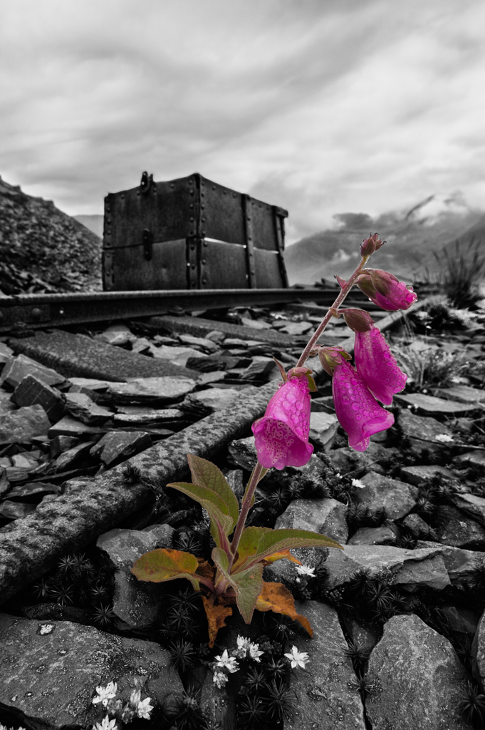
I originally cropped this into portrait format, processed it, and subsequently presented it that way for several years. When I revisited it, I decided to process it in its original landscape format, and then decide afterwards what format to present it in.
Although I’m not a huge advocate of the selective colour technique (having only ever done it on three images for my ARPS panel) in my opinion, it does give this particular image more impact. With that in mind, I carefully made a selection of the flower in colour, and then converted the background into monochrome. I might at some point do a straight monochrome version, but I’ll have to process it differently. By taking away the impact of colour, the flower could get lost, so I would have to figure out how to give it emphasis through more selective toning and also selective sharpening. This latter technique is something I’ve never tried and so have been reading up on of late – this would make an interesting first subject!
This photo was taken on my old Sigma 14mm lens, a lens best described as ‘idiosyncratic’. The lens could focus remarkably close and consequently the flower is incredibly sharp, but the edges of the image are maybe less so, while the chromatic aberration and fringing was that bad I ended up using a very small brush to physically remove it. At least there was no lens flare, something the lens was susceptible to in almost any light!
So does it work in this format? In a straight 3×2 format, there’s maybe too much at either end of the frame, as the focus of attention is in the middle of the image. However, the railway track provides a dynamic lead in across the frame, and take the eye to Mount Snowdon on the right hand side.
I’m undecided on the format, here’s a crop in the portrait format:
And another in the square format compromise:


This is a really tricky one, but I reckon your choice of subject leaves no option but to use the selective colour technique. I prefer the mono image of course, but the flower would be pretty meaningless in monochrome, so I think it is a good compromise. I like the square image best..for some reason, I expect the rubbish waggon to be in sharper focus when in portrait mode, but to my uneducated eye it looks great in the square format. It’s a super shot in whatever crop, and I’m only splitting hairs here 🙂
LikeLike
Thanks for the feedback Iain, I’m going to ask for some audience feedback at my next talk in a few weeks time and see what they think. I’m still in two minds. Or maybe three? But I agree about the flower, it’s almost a bit too small in the frame to have much impact in monochrome, the colour allows it to punch above its compositional weight!
LikeLike
Nice. I’m thinking I like the portrait composition best myself, but personally I’d crop a bit more of the sky off (at about halfway above the top of the wagon).
LikeLike
Thanks Graham, I might try that and see what it looks like. This is one of the few phtos I’ve taken where there are so many potential variations in terms of crop formats, I’m increasingly drawn to the square format currently, but that may change next week!
LikeLike